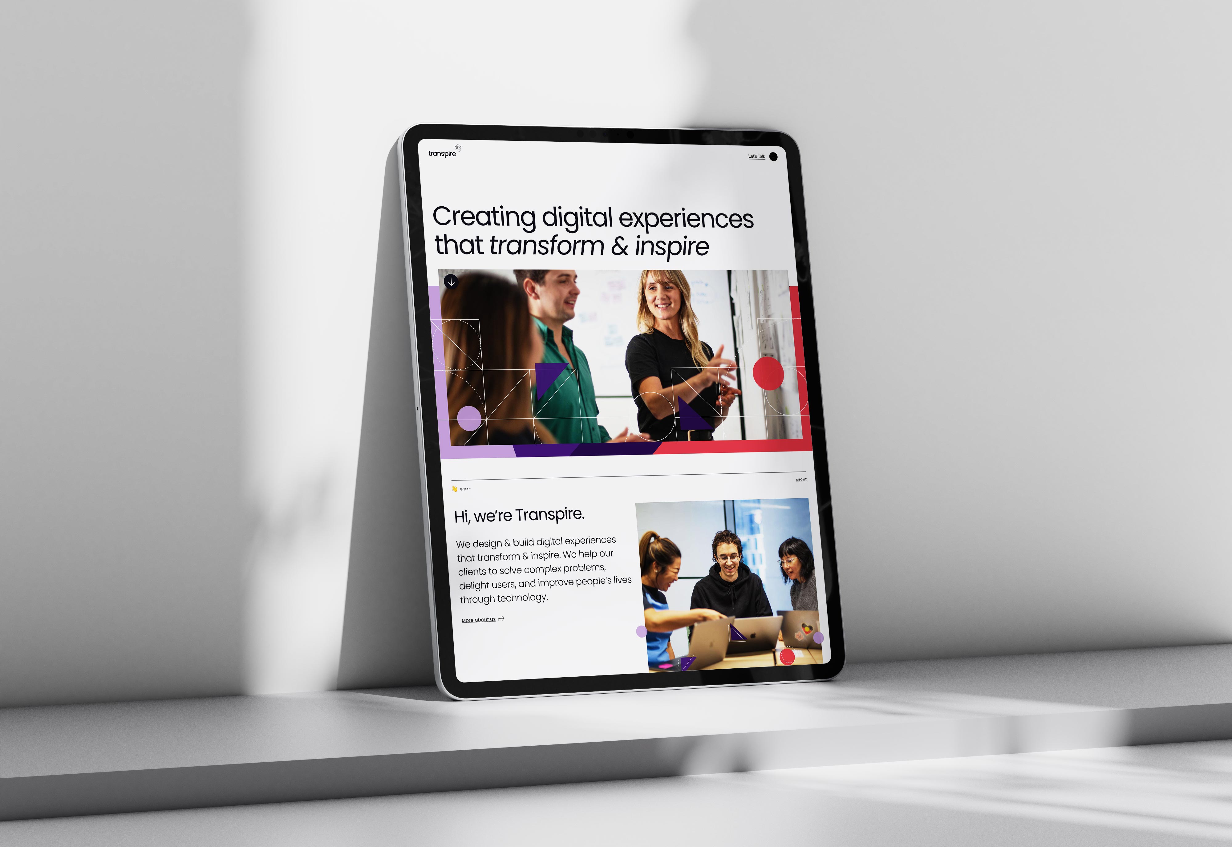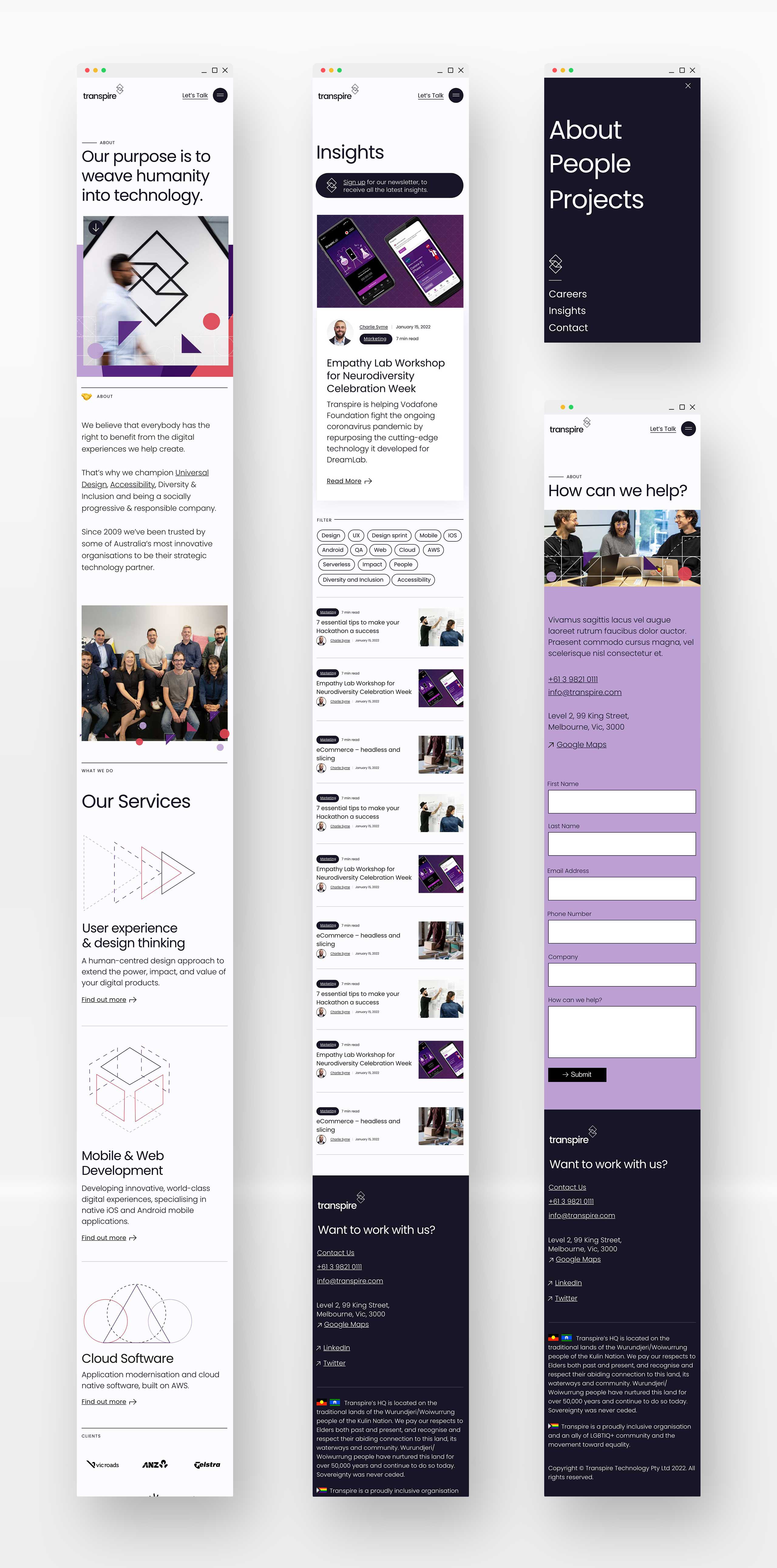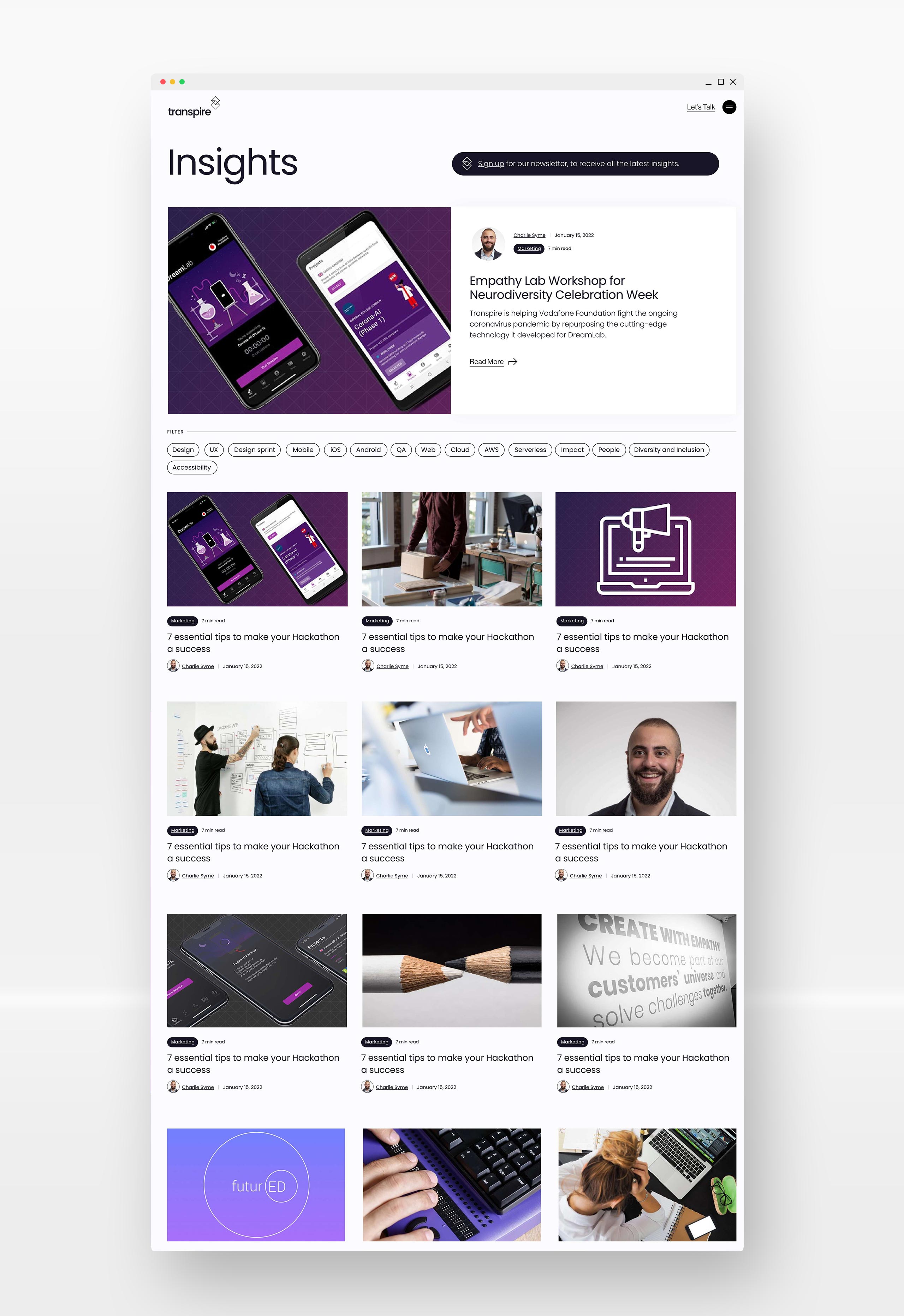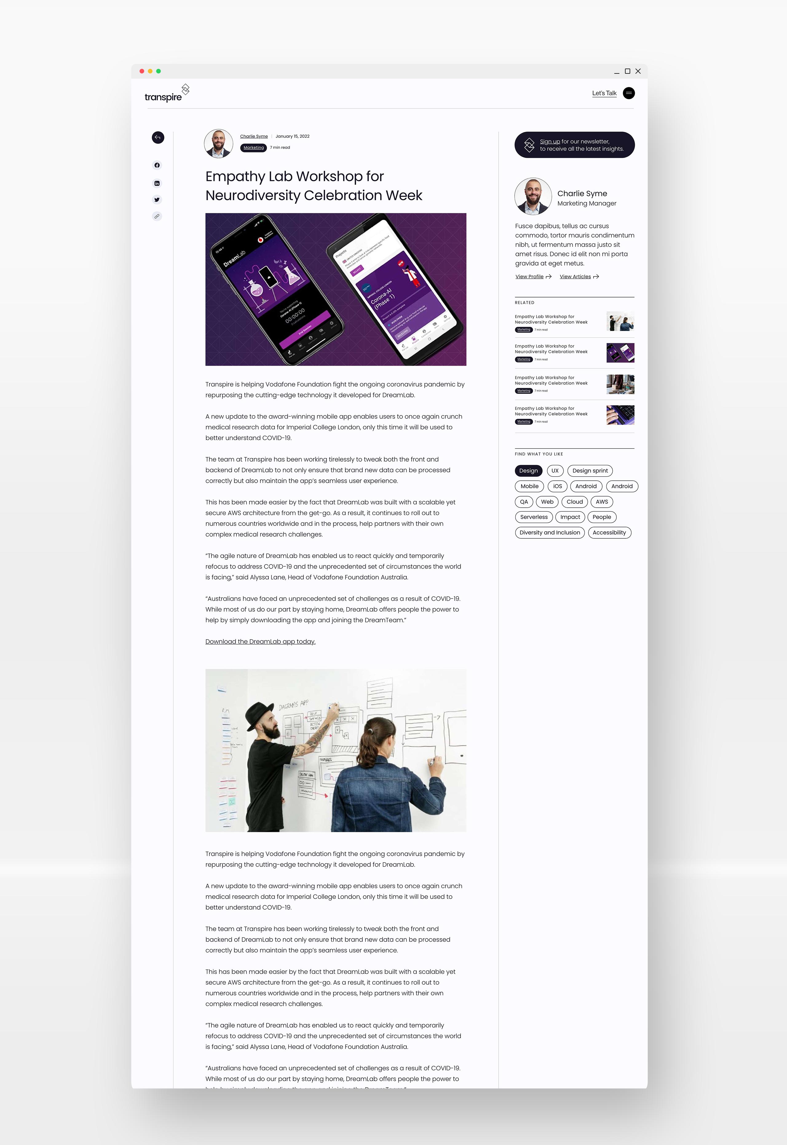


Earlier this year Transpire approached Studio 21 to reinvent their website and help elevate their brand identity. We were happy to oblige.
Transpire expressed a need to modernise their brand identity in a way that made it feel truly authentic, trustworthy and premium. They also pride themselves on their unique boldness, something that had to come across in the design aesthetic. The website itself was somewhat dated, and although functional was in need of a complete overhaul from a content and design perspective. From a technical standpoint, the headless structure of the current website build was becoming increasingly difficult for the Transpire team to maintain – something Studio 21 would assist with fixing.
We worked closely with the Transpire marketing team to explore brand styles, including colours, typography, photography, graphics, iconography and website layouts that fit with the brand attributes. The logo was simplified, allowing brand colours to be used across the brand graphics without clashing with the logo. The Transpire team connected strongly with geometric shapes, which tied in nicely with their logo and the idea of transformation. These geometric shapes were used to create animated graphics for each service, as well as decorative elements across the brand. The whole visual aesthetic for Transpire was simple, yet sophisticated, as well as modern and timeless. We love it – so did they.
It was important for Transpire that the website was highly accessible, and this was by far one of our biggest challenges for the build. Website accessibility is hard, let’s face it. We did everything within our power to optimise their new Wordpress website for accessibility, but we also realised that we could easily have spent another few months optimising it. The result was great – and we had a lot of takeaways from the experience.
